case study
Jenesis2 — a print-on-demand store built to run itself
Build an online apparel store that could carry a growing product catalogue without the owner hand-managing stock, and that would look considered enough to justify its price point.
- Client
- Faith-based apparel brand, print-on-demand
- Project
- Ecommerce website
- Status
- Completed
the problem
What needed solving
Print-on-demand businesses carry an awkward operational load: products are created continuously, nothing physically exists until it is ordered, and the storefront has to look established from the very first visit. A generic template store handles the transaction but rarely carries the brand, and manual product management becomes the bottleneck as the catalogue grows.
the approach
How we solved it
A custom storefront built around the product catalogue rather than bolted on to it, with an AI-assisted pipeline supporting product creation and presentation. The checkout was treated as the most important page in the build, and the visual design was developed to make a young brand read as an established one.
Storefront and catalogue
Product and category pages structured so items are genuinely findable, rather than hidden behind a search box.
Checkout flow
A short, mobile-first checkout, since abandonment concentrates at exactly this step.
Secure payments
Payment integration configured and tested end to end before launch.
Print-on-demand pipeline
Ordering wired to fulfilment so no physical stock has to be tracked.
Brand-led design
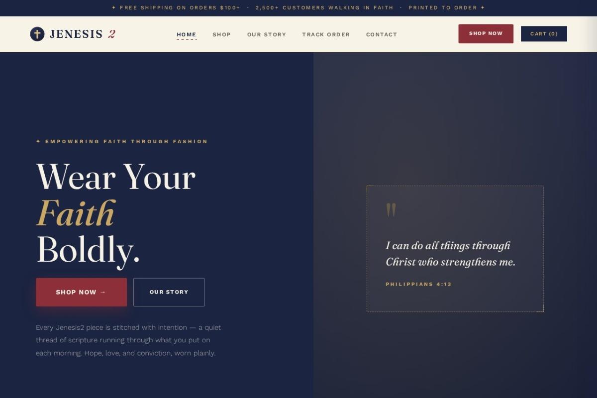
A deliberately editorial visual treatment — serif display type, scripture pull-quotes, restrained palette — to carry the brand's tone.
what it does
Key features
- Print-on-demand fulfilment, so no physical inventory is held
- Secure card checkout, tested with live transactions before launch
- Mobile-first product browsing and checkout
- Editorial brand treatment across hero and campaign sections
- Product catalogue structured for search visibility
the hard part
Challenges
The main design tension was between a faith-led brand voice and a conversion-focused storefront: the site needed to feel considered and quiet while still moving people efficiently toward checkout. The resolution was to keep the editorial treatment for the hero and brand moments, and let the product and checkout flows stay plain and fast.
results
Measured outcomes
We don't publish performance figures for this project because analytics weren't in place from the start, and quoting numbers we can't substantiate would be worthless to you. The site is live and linked above — the most useful thing we can offer is that you go and judge it yourself.
services used
What this project involved
The services that did the work on this build.
service
Ecommerce Development
An online store has a harder job than a normal website: every extra second of load time and every confusing checkout step costs you a sale you had already won.
service
Web Development
A website should do work: bring in enquiries, answer the questions your customers keep asking, and make your business look like the serious operation it is.
service
Website Design
Most visitors decide whether a business looks credible within seconds of the page loading, and they make that judgement on a phone.
Have a project like this?
If something here looks close to what you need, tell us about it and we'll give you an honest view of what it would take.